Actually I am following quite a lot of these kinds of Instagram accounts in my personal account. After following them for a while, I reckon that most of the accounts are giving out information by cramping texts in one post. They tend to ignore the layout and feed of the account and their aim to to put all of the information that they would like to communicate all into one post. @whenharrymetsalad is one of the examples.
@whenharrymetsalad posted all of the information all in one post in form of an album.
First page
showing information of what raw ingredients are needed to create the final outcome.
Second page
a detailed version of what ingredients are needed, and the portion of them.
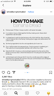
Third page
the method page. With steps listed directly for people to follow.
Last page
A short clip showing the process of making the real outcome.
What I reckon
+ve
- showing people what ingredients they need for making the meal and the final outcome on the first page can definitely attract people form clicking onto the post.
- people get to know what exactly they need for making the meal only by looking at the cover page of the post, they can quickly scan them through and know if they have the ingredients at home ready for them to make the meal. If they found out that they do not have the ingredients, they can just keep on scrolling until they find one with the ingredients they have.
-ve
- the layout is a bit boring with a grey background colour which is not colourful at all
- the method page is cramped with words which will make audiences less interested to follow
@nutriitional
Another instagram account that promotes healthy eating. Found this really interesting as it matches with our theme of promoting healthy eating by having people eating more colours. We could put the sayings onto the captions.


No comments:
Post a Comment